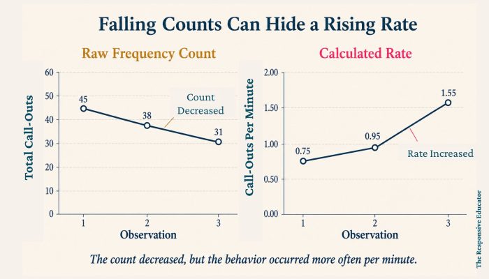
Imagine that you are reviewing three weeks of data for a student who calls out during instruction. The totals appear encouraging: 45 call-outs during the first observation, 38 during the second, and 31 during the third. If you look only at those frequency counts, it seems as though the intervention is working.
Then you notice that the observation periods were not the same length. The first observation lasted 60 minutes, the second lasted 40 minutes, and the third lasted only 20 minutes. The student had fewer total call-outs each time, but the student also had much less time in which to call out.
Once you calculate the rate of behavior, the pattern changes completely. The student called out 0.75 times per minute during the first observation, 0.95 times per minute during the second, and 1.55 times per minute during the third. The raw counts went down, but the behavior was actually occurring at a faster rate.
That is the problem rate graphs are designed to solve. They show how often a behavior occurs relative to a consistent unit of time, allowing you to compare observations fairly even when those observations are different lengths. Instead of giving families or IEP teams a collection of numbers that only appear comparable, you can show them what was actually happening.
This article assumes you have already decided that rate recording is the right behavior measurement method. If you are still deciding whether to use frequency, rate, duration, interval, or another method, begin with Behavior Data Collection: How to Choose the Right Measurement Method. Because a rate calculation begins with a frequency count, I also recommend reading Rate Count: Comparing Behavior Fairly Across Different Observation Times before continuing.
A rate graph plots the calculated rate of behavior across days, lessons, sessions, or other observation periods. The horizontal, or x-axis, shows when each observation occurred. The vertical, or y-axis, shows the number of responses per selected unit of time, such as call-outs per minute, disruptions per hour, or elopements per school day.
In behavior analysis, rate is calculated by dividing the number of times a behavior occurred by the amount of time observed:
Rate = Number of occurrences ÷ Observation time
You may see frequency and rate used somewhat differently across school systems and ABA resources. Some people use frequency to mean the number of responses, while others use it to mean responses per unit of time. In this series, frequency count refers to the raw number of occurrences, and rate refers to that count divided by time. Naming the unit clearly on the graph prevents confusion regardless of the terminology a team uses.
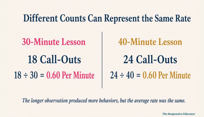
Rate graphs are especially useful when observation periods vary. If every math lesson lasts exactly 30 minutes and data is collected for the entire lesson each day, a behavior frequency graph may already allow a fair comparison. If one observation lasts 15 minutes and another lasts 45, graphing the raw totals can create a misleading picture. Rate data collection gives those observations a common denominator.
Calculating rate is an important first step, but a page of decimals does not make trends easy to recognize. Rate graphs turn those calculations into a visual pattern. You can see whether the rate of behavior is generally increasing, decreasing, remaining stable, or changing after a new intervention begins.
The graph is also useful because the people reviewing your data may not have lived with it every day. You may remember that the student had a difficult week after a schedule change, but a parent, administrator, or related service provider will not automatically know that. A clear graph gives the team a shared starting point and makes it easier to discuss what should happen next.
The goal is not to produce an impressive chart for the next meeting. The goal is to make the data understandable enough that the team can evaluate the intervention, recognize concerns, and make better instructional decisions for the student.

Before creating the graph, calculate every observation using the same time unit. If you decide to report calling out per minute, each point must represent call-outs per minute. Mixing responses per minute, per class period, and per hour on the same graph would make the data impossible to compare.
Record the number of times the behavior occurred and the length of the observation. Divide the count by the observation time. For example, 12 call-outs during a 30-minute lesson equals 0.4 call-outs per minute.
If decimals make the result difficult to explain, you can convert the same rate to a larger unit. A rate of 0.4 call-outs per minute is equivalent to 24 call-outs per hour. The underlying data has not changed; you are simply expressing it in a unit that may be easier for other people to understand.
The x-axis should show the order in which the observations occurred. Depending on the purpose of your graph, you might use calendar dates, school days, therapy sessions, class periods, or another clearly defined sequence. Use labels that another person could understand without needing you to stand beside the graph and explain them.
Do not label the y-axis only as “behavior” or “number.” Write the complete unit, such as “call-outs per minute” or “aggressive incidents per hour.” That small detail tells the reader exactly what each data point represents and prevents the rate from being mistaken for a raw frequency count.
Plot one point for each observation and connect the points in chronological order. The resulting line allows you to see changes across time. If you use software to add a trend line, remember that the trend line summarizes the overall direction; it does not erase the day-to-day variability that may also matter.
Place a vertical phase line on the graph when a new intervention begins or another important condition changes. Add a brief label such as “reinforcement system introduced,” “returned from winter break,” or “classroom schedule changed.”
Phase lines do not prove that the event caused the behavior to change, but they help the team see when the change occurred and ask more informed questions.
Rate recording can be expressed per minute, per hour, per class period, per day, or another meaningful unit. The best unit is not necessarily the smallest one. It is the one that represents the behavior accurately and makes the result easy to understand.
Telling a parent that a student averages 0.8 call-outs per minute is mathematically correct, but many people will understand “about 24 call-outs during a typical 30-minute lesson” more quickly. On the other hand, a behavior that occurs only a few times each week would be difficult to interpret as a tiny per-minute decimal. In that case, a daily or weekly rate may communicate the pattern more clearly.
Once you select a unit for a graph, use it consistently. If you later decide that another unit would be clearer, recalculate all of the observations and create a revised graph. Do not change the unit halfway across the same graph.

The y-axis should make changes in the student’s rate visible without exaggerating them. If the highest rate is approximately two behaviors per minute, a graph that extends to 20 will compress the points near the bottom and make meaningful differences difficult to see. A smaller scale would communicate the pattern more clearly.
The opposite problem occurs when the scale is too low. Data points may not fit, or the graph may make a modest change look more dramatic than it really is. I usually choose a simple interval that extends slightly above the highest expected rate and adjust it if the student’s data moves outside that range.
Whenever you change the scale, use the same scale for all phases you intend to compare. A graph can be technically accurate and still give a misleading visual impression if the scale changes from one section to another.
Once the graph is complete, resist the urge to make a decision based on one point. Students have difficult days, routines change, and unexpected events affect behavior. Start by looking at the overall pattern and then use the surrounding information to understand what may be influencing it.
Level refers to the general amount of behavior shown on the graph. A student who calls out approximately once every minute presents a different instructional concern from a student who calls out once every 15 minutes. The level helps you judge the size of the problem and whether the current support is producing enough change to matter in the classroom.
Ask whether the rate is generally increasing, decreasing, or staying about the same. A downward trend may suggest progress when the goal is to reduce a challenging behavior. For a positive behavior such as asking for help appropriately, participating in discussion, or initiating peer interactions, an upward trend may be the desired result.
The direction alone is not enough. A small decrease may be meaningful for a difficult behavior, but it may not be sufficient when safety is involved. Professional judgment is still needed to decide whether the amount and speed of change are acceptable.
Some rate graphs show data points clustered closely together. Others move sharply up and down from one observation to the next. High variability may indicate that the behavior is strongly affected by particular tasks, settings, people, times of day, or other conditions.
Variability does not automatically mean the intervention has failed. It tells you to look more closely at what is different across those observations. The graph should guide your next questions rather than pressure you to reach a quick conclusion.
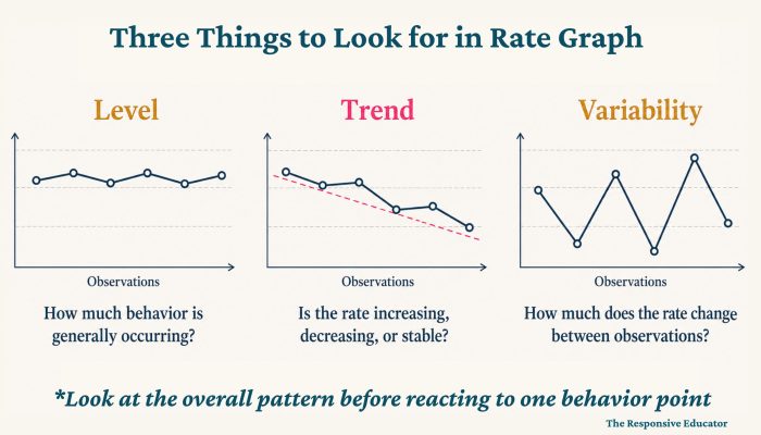
When an intervention begins, compare the level, trend, and variability before and after the phase line. Do not rely only on the first point after the change. Several observations are usually needed before you can decide whether a new pattern is developing.
The amount of time you allow depends on the seriousness of the behavior. A minor classroom disruption may be monitored over several weeks, while aggression, self-injury, elopement, or another safety concern requires immediate safety planning and much closer review. Improvement matters, but safety concerns cannot be allowed to continue simply because the graph is moving in the right direction.
I once worked with a student whose disruptive behavior resulted in frequent removals from class. When I compared his rate of behavior across subjects, math stood out immediately. His disruptive behavior occurred at a much higher rate during math than it did anywhere else.
The graph showed us where to look, but it could not tell us why math was different. As we examined the surrounding circumstances, it became clear that the work was difficult for him. Disruptive behavior led to removal from class, and removal allowed him to escape assignments he did not expect to complete later.
If we had focused only on lowering the line on the graph, we might have increased consequences without addressing the academic difficulty or the escape the student was receiving. Instead, the pattern helped us ask better questions about instruction, task difficulty, skill gaps, and what happened after the behavior.
Rate graphs do not replace classroom observation, ABC data collection, or a functional behavior assessment. They show when and where patterns may exist. If you need to examine what happens immediately before and after the behavior, ABC data collection can help you investigate those patterns more closely.

If observation periods are different lengths, plotting the raw totals defeats the purpose of rate recording. Always graph the calculated rate. Keep the original count and observation duration on the data sheet so another team member can verify how the rate was calculated.
A point representing responses per minute cannot be compared directly with a point representing responses per hour. Choose one unit and convert every observation to that unit before graphing. Clear labeling is especially important when several people collect or review the data.
Rate works best for discrete behaviors with a clear beginning and end. It is not usually the best choice when you need to know how long a behavior lasts, when a behavior occurs so rapidly that individual responses cannot be counted accurately, or when opportunities to perform the behavior vary substantially.
Duration, interval recording, or percentage of opportunities may provide a more accurate picture in those situations.
A decrease after an intervention begins is encouraging, but the timing alone does not prove that the intervention caused the change. A medication adjustment, staff change, school break, easier assignment, or other variable may also have influenced the data. Document meaningful changes with phase lines and combine the graph with observations and team input.
Behavior data is not meant to sit in a folder until an IEP or BIP meeting. Update the graph often enough that it can guide instruction while the intervention is still happening. A pattern that becomes obvious today may help you adjust support before several more weeks are lost.
Teachers can calculate behavior rates and build graphs in Excel or Google Sheets, but the process becomes time-consuming when several students or behaviors are being monitored. The calculations must remain consistent, the axes must be labeled correctly, and the graph must be updated often enough to support real decisions.
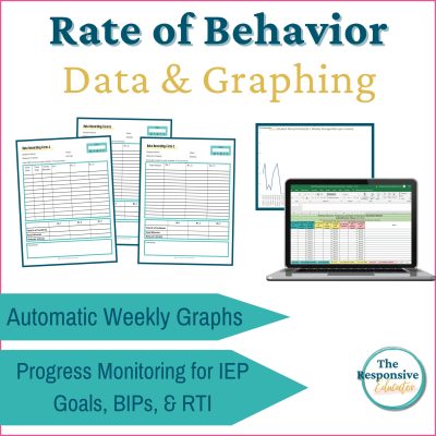
That is why I created my Rate Behavior Tracking Sheet and Graphing System. It includes three rate recording forms, automatic rate calculations and graphs in Excel and Google Sheets, an example graph with trend and phase lines, quick Excel tips, and directions for adding phase lines. It also includes a Rate of Positive Interactions to Corrections form, which allows teachers to examine an adult behavior that can affect the classroom environment.
The system handles the repetitive calculations and graph formatting, but it does not make decisions for you. Your knowledge of the student, the classroom context, and the purpose of the intervention remains essential. The resource simply makes it easier to spend your time interpreting the information instead of rebuilding a spreadsheet.
If you are developing a larger progress-monitoring system, the rate resource works alongside my frequency, duration, and interval recording and graphing resources. These tools are also included in my Behavior Data Collection and Graphing Bundle for teachers who need several measurement options rather than a single form for every behavior.
Rate graphs are valuable because they make unequal observation periods comparable. A falling frequency count can hide a rising rate, while an increasing count can sometimes reflect nothing more than a longer opportunity to observe. Calculating and graphing behavior relative to time gives the team a more accurate starting point.
The graph still does not tell the entire story. It cannot explain the function of the behavior, identify every environmental influence, or decide what intervention a student needs. What it can do is help teachers recognize patterns, communicate those patterns clearly, and use evidence alongside professional judgment.
The goal is not simply to make the line move in the preferred direction. The goal is to understand what is changing, decide whether the support is helping, and use that information to teach the skills the student needs for greater success and independence in school and beyond.
If you are ready to continue through the behavior measurement series, the next post is Duration Count: Measure How Long a Behavior Lasts. Duration recording is the better choice when the length of the behavior matters more than the number of times it begins.