Tracking student behavior is a critical part of creating effective behavior plans, but interpreting raw data can often feel overwhelming. Numbers and observations are helpful, but they don’t always provide the clarity needed to see trends or make informed decisions. This is where visuals can be a game-changer.
By transforming behavior data into charts, graphs, and other visual formats, you can more easily identify trends, track progress, and make adjustments to your interventions. Whether you’re working with individual students or looking at classroom-wide behaviors, visuals simplify the process and make the data more actionable.
Imagine looking at a long list of behavior data points. Would you know at a glance whether a student’s behavior was improving? Probably not. Now, imagine seeing the same data plotted on a graph. Suddenly, it’s much easier to spot trends, patterns, and areas where progress is being made—or where interventions need tweaking.
Visuals are powerful because they:
When you use visuals, you’re not just collecting data—you’re creating a roadmap for effective behavior support.

The type of visual you use depends on the behavior you’re tracking and the goals you’re working toward. Here are some of the most common types of visuals and how they can help you.
If you’re looking for a more complete overview of different behavior data collection methods commonly used in school settings, be sure to grab my free Data Collection for Student Behavior resource on TPT — it explains even more options and when to use each one.
ABC (Antecedent-Behavior-Consequence) data goes beyond simple tracking by helping you understand the context of behaviors. It highlights what happens before, during, and after a behavior, making it easier to identify patterns, triggers, and effective consequences.
When you’re analyzing ABC data — or comparing behaviors across different categories or settings — bar charts can be especially useful. Bar charts provide a clear visual snapshot of how behaviors vary depending on the situation, making trends easier to spot and discuss.
Example: You could create a bar chart showing how often different antecedents occur before a behavior, how long it typically takes the student to respond (latency), or what types of consequences are most common after a behavior.
Why It’s Helpful: Visualizing this information helps you quickly identify trends — such as whether certain activities, instructional types, or consequences are more likely to trigger or maintain a behavior — so you can adjust your supports and interventions more effectively.
Tip: Using digital templates for bar charts makes compiling and analyzing ABC data faster and easier, giving you clear insights without extra manual work.

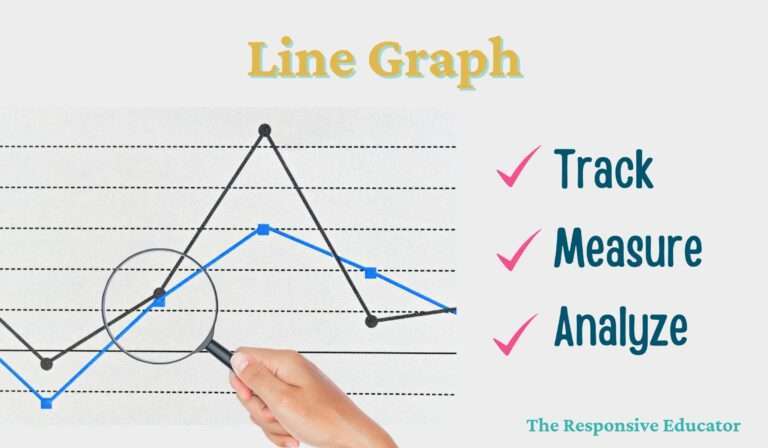
Different types of behavior data can be visualized using line graphs, depending on what you’re measuring. Here are four of the most common approaches:
Frequency graphs track how often a behavior occurs over a given period of time. They are one of the most common tools for showing whether a behavior is increasing, decreasing, or staying the same. This makes it easier to spot trends across days, weeks, or sessions.
Example: Tracking how often a student calls out during class each week.
Why It’s Helpful: Provides a visual representation of whether interventions are making a difference.
Rate graphs combine frequency and time to show how often a behavior occurs within a set period (such as behaviors per hour). They are especially helpful when observation periods differ in length, allowing you to compare behavior rates accurately. This type of graph gives a clearer picture when session times aren’t always consistent.
Example: Calculating how many times a student raises their hand per hour.
Why It’s Helpful: Allows you to account for variations in observation lengths and compare behaviors accurately.
Duration graphs focus on measuring how long a behavior lasts during an observation period. Rather than counting how many times a behavior happens, you’re capturing the amount of time the student engages in the behavior. This helps identify whether behaviors are becoming more sustained or shorter over time.
Example: Measuring how many minutes a student stays engaged in an assignment.
Why It’s Helpful: Helps you monitor increases or decreases in behavior length over time.
Interval graphs focus on whether or not a behavior occurs during specific time segments. Instead of measuring how often or how long a behavior happens, you simply record its presence or absence at set intervals. This approach is particularly useful for observing ongoing behaviors like staying on task.
Example: Checking if a student remains seated during each 10-minute interval throughout the day.
Why It’s Helpful: Breaks down behaviors into manageable pieces, making patterns easier to spot.
Using visuals doesn’t have to be time-consuming or complicated. In fact, with the right approach, it can become a seamless part of your data collection process.
Templates and apps designed for behavior tracking can save you time by automatically generating graphs and charts. Instead of manually creating visuals, you can focus on analyzing the data and planning your next steps.
Set aside time each week to review your charts and graphs. This helps you spot trends early and make adjustments to interventions before issues escalate.
Whether you’re collaborating with colleagues, presenting to administrators, or updating parents, visuals make it easier to communicate progress. They provide a clear, concise way to show how behavior is changing over time.
If you’re feeling overwhelmed by the thought of creating visuals, don’t worry—there are tools available to help. My Behavior Progress Monitoring & Graphing Bundle is designed specifically to support visual behavior tracking. It includes:
Editable tracking sheets for frequency, duration, and interval data
Automatic graphing templates in Excel or Google Sheets
Easy-to-use formats for individual students or small groups
These tools make it simple to visualize trends and progress without hours of prep time. Click here to explore the bundle and make behavior tracking more visual and efficient.

Behavior tracking isn’t just about collecting data—it’s about understanding your students and making informed decisions to support their growth. By using visuals like graphs and charts, you can turn raw numbers into actionable insights that guide your interventions and highlight progress.
If you’d like a quick overview of the different types of behavior data collection and guidance on when to use each one, download my FREE resource, Data Collection for Student Behavior, on TPT. It’s designed to help you choose the right method for the behaviors you’re tracking and make the process easier.


Support your students’ individual needs with our exclusive Classroom Concerns Checklist.
Identify key concerns in areas like cognitive skills, communication, social/emotional behavior, and more.
Sign up now to receive instant access and valuable insights on addressing classroom concerns.
Don’t miss out, join our community today!