Imagine collecting interval data on a student’s out-of-seat behavior for three weeks. Each day, you calculate the percentage of intervals in which the student left their assigned area. At the end of those three weeks, you have a stack of data sheets filled with checkmarks and percentages.
You can read through the sheets one at a time, but it may still be difficult to tell whether the student’s behavior is improving. A percentage of 75% on Tuesday might look better than 90% on Monday, but what does that mean when Wednesday’s percentage rises again? Looking at individual observations makes it easy to focus on daily changes without recognizing the larger pattern.
Now imagine placing those same percentages on a graph.
The pattern becomes much easier to see. Instead of looking at one observation at a time, you can recognize whether the percentage of affected intervals is decreasing, remaining relatively stable, or beginning to increase again. A behavior interval chart turns separate observations into a visual picture of the student’s progress.
That is why graphing interval data is so valuable. A graph does more than organize percentages. It helps teachers recognize patterns, evaluate interventions, and communicate progress in a way that parents, administrators, related service providers, and IEP teams can understand.
Just as importantly, a graph gives everyone a shared starting point. Rather than debating individual incidents or relying on what someone remembers from a difficult day, the team can examine the overall trend and decide what the student may need next.
This article assumes you have already decided that interval recording is the appropriate measurement method. If you are still comparing frequency, duration, rate, interval recording, and other options, begin with Behavior Data Collection: How to Choose the Right Measurement Method.
If you are deciding between the two types of interval recording, read Partial Interval Recording vs. Whole Interval Recording: Which Should You Use? before you begin graphing the results.
Collecting interval data is only the first step. Its real value comes from looking at what happens across multiple observations.
A single observation tells you what happened during one lesson, activity, or period of the day. A behavior interval graph allows you to step back and ask larger questions. Is the behavior gradually improving? Did the pattern change after a new intervention began? Has progress stalled? Does the student consistently struggle during particular activities?
Those are the questions classroom teachers, behavior teams, and IEP teams are trying to answer. A behavior interval chart makes the answers easier to see because it turns multiple data sheets into one visual trend.
Graphs also improve communication. The teacher collecting the data may already recognize the pattern because they see the student every day. Parents, administrators, and related service providers do not always have that same context. A clear interval graph helps them understand the student’s progress without requiring them to interpret pages of raw data.
The purpose is not simply to produce another chart for a file or progress report. The purpose is to help everyone understand the story the data is telling so the team can make better decisions about instruction and support.

Before interpreting a behavior interval chart, make sure you understand exactly what its percentages represent. The same percentage can tell two very different stories depending on whether the data came from partial interval recording or whole interval recording.
With partial interval recording, the percentage represents the number of intervals in which the behavior occurred at least once. If the chart shows that a student was out of their seat during 95% of the observed intervals, that does not mean the student was out of their seat for 95% of the observation.
It means the student left their seat at least once during nearly every interval. The student may have been out of their seat for only a few seconds during each interval, or they may have spent most of the observation moving around the room. Partial interval recording does not distinguish between those situations.
This is why partial interval data should not be interpreted as duration data. It helps you estimate how consistently the behavior appeared throughout the observation, but it does not tell you exactly how long the behavior lasted or how many times it occurred.
The meaning changes when the behavior interval chart contains whole interval data. With whole interval recording, the percentage represents the number of intervals in which the student demonstrated the target behavior for the entire interval.
Suppose you are measuring on-task behavior. A score of 95% means the student remained on task for the full interval during 95% of the observed periods. If the student became distracted for even a short time during an interval, that interval would not be marked as successful.
This stricter scoring system can be useful when you need to know whether a student is maintaining a behavior or replacement skill over time. However, it can also underestimate success because an interval receives no credit when the student demonstrates the behavior for most—but not all—of the interval.
Because partial and whole interval percentages mean different things, every behavior interval graph should clearly identify the recording method used. Someone reviewing the chart should not have to search through the original data sheets to determine what the percentage means.
Include the operational definition of the behavior, the interval type, and the interval length in the graph title, notes, or accompanying documentation. For example:
A clear label makes the graph easier to interpret and reduces the risk of someone drawing a conclusion the data does not support.
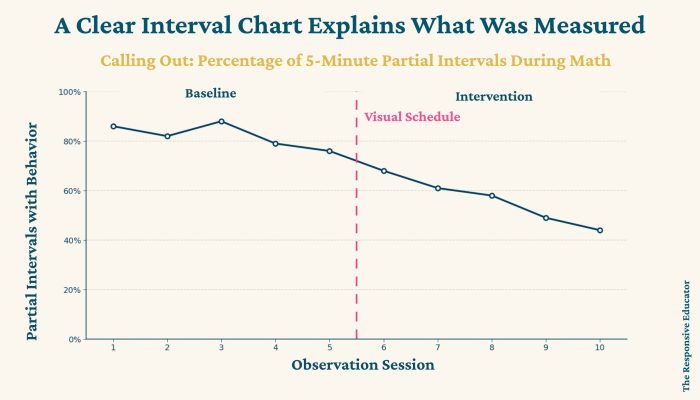
Once you have created your behavior interval chart, the next step is interpreting what it shows. I rarely place much weight on a single data point. Every student has easier and more difficult days, and one unusually high or low percentage does not necessarily mean the intervention is working or failing.
Instead, I look for patterns over time. Is the percentage of intervals with the challenging behavior gradually decreasing? Is the percentage of successful whole intervals increasing? Has the data remained relatively stable? Did the pattern change after a new intervention or environmental support began?
Those longer-term patterns are usually more meaningful than an isolated observation. A single point may tell you what happened on Tuesday. A trend helps you understand what has been happening across several days or weeks.
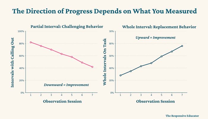
The first thing to examine is whether the data is generally increasing, decreasing, or remaining stable. The meaning of that direction depends on what the graph measures.
If you are graphing partial interval data for a behavior you want to decrease, a downward trend may indicate improvement. If you are graphing whole interval data for an on-task or replacement behavior, an upward trend may indicate that the student is maintaining the skill more consistently.
Do not assume that “up” always means better or that “down” always means worse. Read the graph title and operational definition before interpreting the direction of progress.
A trend line can move in a positive direction while the individual data points still vary considerably. That variability matters.
Imagine that a student’s partial interval percentages are 80%, 35%, 75%, 30%, and 70%. The average may suggest some improvement, but the wide shifts tell you that the student’s performance is not yet consistent. I would want to know what was different on the lower-percentage days before concluding that the intervention was reliably effective.
Large variations may be connected to instructional demands, schedule changes, staffing, medication, sleep, peer interactions, or how consistently the intervention was implemented. The graph helps you notice the variation, but additional information is needed to understand it.
When someone else collected the interval data, I want to know how the observations were conducted. Were they using one-minute or five-minute intervals? How long did each observation last? Were the observations conducted during the same activity each day? How many days of data are represented?
Those details affect how much weight I give the pattern. Thirty one-minute intervals collected during a single lesson create many individual interval marks, but they still represent only one day and one classroom situation. Data collected consistently across several weeks may provide a much stronger picture of the student’s typical performance.
The graph tells you what was recorded. Understanding how the data was collected helps you decide how confidently you can use it to make decisions.
A behavior interval chart is an important tool, but it should not be interpreted by itself. The graph may show that behavior changed, but it cannot explain why the change occurred.
Imagine a chart showing that a student’s out-of-seat behavior occurred during 90% of the intervals one week and 55% several weeks later. That change is encouraging, but it immediately raises more questions. Did the teacher introduce a new seating arrangement? Was a reinforcement system added? Did the student’s schedule change? Was the behavior measured during the same activity and time of day?
This is why I encourage teams to examine interval graphs alongside classroom observations, teacher notes, ABC data, intervention-fidelity information, and other relevant records. The graph helps identify the pattern. The additional information helps the team understand what may have contributed to it.
A graph should guide your professional thinking. It should not replace it.
The goal is also not simply to prove that a behavior decreased. The team still needs to consider what skill the student is learning in its place. If out-of-seat behavior decreases, is the student becoming more independently engaged? Are classroom materials easier to access? Has the student learned how to appropriately request a break or ask for help?
Behavior data becomes more useful when it helps the team understand both the behavior that is changing and the independence the student is developing.
Phase lines make a behavior interval chart much more meaningful. A phase line is a vertical line placed on a graph to mark an important change in the student’s program, environment, or support.
You might add a phase line when:
Without phase lines, a graph may show that the percentages changed without helping the reader understand what happened at that point. With phase lines, the team can see whether a shift in the data occurred around the same time as an intervention or environmental change.
A phase line does not prove that the change caused the student’s behavior to improve or worsen. It identifies a relationship the team may need to explore. That distinction matters because student behavior is rarely influenced by only one factor.
If you change the interval length, recording method, or operational definition, documenting that change is especially important. Percentages collected under two different procedures should not be treated as though they are directly comparable.
An interval chart is only as useful as the information it communicates. The graph should allow another teacher, parent, administrator, or IEP team member to understand what was measured and what changed without needing an extended explanation.
“Behavior Data” is not a useful graph title. It does not tell the reader which behavior was measured, which interval method was used, or what the percentages represent.
A title such as Percentage of Partial Intervals With Calling Out During Math provides much more information. It tells the reader what behavior was measured, how it was measured, and where the observation occurred.
Specific labels reduce confusion and make it easier to compare results during future meetings.
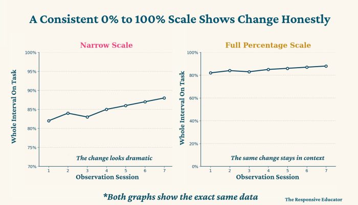
Because interval data is reported as a percentage, the Y-axis will usually range from 0% to 100%. Keeping that scale consistent makes it easier to compare progress across weeks and prevents small changes from appearing larger than they really are.
A graph that displays only 70% to 100% may make a change from 82% to 88% look dramatic. The difference may still be meaningful, but the visual scale should not exaggerate it.
The purpose of the graph is to communicate the student’s progress accurately—not to make the intervention appear more effective than the data supports.
The X-axis should show when each observation occurred. Depending on how often data is collected, you may use individual dates, weeks, or reporting periods.
Be careful about combining observations conducted under very different conditions. A percentage from a ten-minute observation during independent work may not be directly comparable to a percentage from a full class period during group instruction. If observation conditions differ, label them clearly or use separate data series.
Whenever possible, keep the graph with the operational definition, interval length, observation duration, and relevant intervention notes. Those details help future team members understand what the chart represents even if the person who originally collected the data is no longer involved.
This is especially important for IEP and BIP progress monitoring. A graph should remain understandable months later, not only while the original observer remembers the context.
A behavior interval chart is useful because it helps the team move from noticing behavior to making informed decisions. The graph can show whether a pattern is changing, but the team still has to decide what that change means for instruction.
If the trend is moving in the desired direction, consider whether the improvement is stable across time and settings. A few encouraging data points are worth noticing, but they may not be enough to begin removing support.
Look for evidence that the student can use the replacement skill with different adults, during different activities, and with gradually reduced prompting. The goal is not simply better percentages under one highly supported condition. The goal is increased independence that can be maintained when the environment changes.

A stable graph is not automatically evidence that the student is unwilling or that the intervention has failed. First, check whether the plan was implemented consistently and whether the measurement method is sensitive enough to show progress.
You may also need to ask whether the intervention teaches the skill the student is missing. A reinforcement system may encourage participation, but it will not teach a student how to begin a difficult assignment, regulate frustration, or request assistance. When the data stays flat, the answer is not always “use the same intervention more intensely.”
If the graph shows that the behavior is increasing or the replacement skill is decreasing, look at what changed around the same time. Review phase lines, classroom notes, schedule changes, task demands, staffing, and intervention fidelity.
The data should prompt investigation rather than blame. The student may need more explicit instruction, a different replacement skill, adjusted environmental support, or an intervention that better matches the function of the behavior.
Creating a consistent behavior interval chart can take time, especially when you are trying to teach, calculate percentages, and prepare progress reports at the same time. The process becomes even more difficult when every teacher or case manager has to create a new interval data sheet and spreadsheet from scratch.
My Interval Behavior Data and Graphing Resource was designed to make that process more manageable. It includes eight interval recording forms with six partial interval and two whole interval options. The forms include five-minute and ten-minute observation formats as well as color and black-and-white versions.
After collecting the data, you calculate and enter one daily percentage for each behavior. The spreadsheet organizes the data by date and updates the behavior interval graphs automatically, so you do not need to build formulas or charts. It works in both Excel and Google Sheets, although phase-line features are available only in Excel.
The resource also includes an example behavior graph with phase lines, a behavior data collection method overview, and Excel tips to help you enter and interpret the information correctly. These supports are useful when more than one person collects data or when you need to explain the process to a classroom teacher, paraprofessional, or other team member.
The purpose is not simply to produce a polished graph. It is to reduce the time spent building data systems so that you can focus on identifying patterns, monitoring IEP and BIP goals, discussing progress with families, and deciding whether supports should continue, change, or gradually fade.
If you need a broader system, the interval resource is also included in my FBA, BIP, and Progress Monitoring Bundle along with frequency, duration, rate, daily point-sheet, FBA, and BIP resources. The individual interval product is the best fit when interval recording is your immediate need. The larger bundle is intended for educators who regularly complete the full process from assessment and intervention planning through progress monitoring.
A behavior interval chart does much more than organize percentages. It helps you see how consistently a behavior or replacement skill occurred across time and whether the student’s support appears to be making a meaningful difference.
Whether you are graphing a challenging behavior measured through partial interval recording or a replacement behavior measured through whole interval recording, the percentage must be interpreted within the context of how the data was collected. Consider the interval length, observation duration, number of observation days, setting, and any changes that may have influenced the student’s performance.
The goal is not simply to collect numbers or create attractive graphs. It is to understand the student well enough to make better instructional decisions. Used thoughtfully, a behavior interval graph can help you recognize progress, identify when an approach needs to change, and determine whether the student is developing skills that will lead to greater independence.
The next article in this series, Behavior Data Collection Examples: How to Measure Common Classroom Behaviors, will bring the measurement methods together. It will walk through common classroom behaviors and explain whether frequency, rate, duration, interval, or another method is likely to provide the clearest information.


Support your students’ individual needs with our exclusive Classroom Concerns Checklist.
Identify key concerns in areas like cognitive skills, communication, social/emotional behavior, and more.
Sign up now to receive instant access and valuable insights on addressing classroom concerns.
Don’t miss out, join our community today!

Support your students’ individual needs with our exclusive Classroom Concerns Checklist.
Identify key concerns in areas like:
…and more to help drive collaboration and problem-solving.
Sign up now to receive instant access and valuable insights on addressing classroom concerns.