Imagine that two students each have three tantrums during the same week. If you look only at frequency, their data appears nearly identical. Both students had three incidents.
Then you look at the duration data. One student cried for approximately three minutes during each occurrence. The other spent nearly 45 minutes screaming, throwing materials, refusing directions, and interfering with instruction during each episode. Suddenly, those two sets of data do not look the same at all.
Counting how many times a behavior occurs tells you one part of the story. Measuring how long the behavior lasts tells you something different. Creating a duration graph allows you to see whether episodes are becoming shorter, lasting longer, or continuing to consume significant portions of the school day.
Graphing also makes the information easier for other people to understand. Parents, administrators, school psychologists, behavior specialists, and IEP teams can look at the same visual pattern instead of trying to interpret several weeks of recording forms. That shared information creates a much stronger starting point for evaluating interventions and deciding what the student needs next.
A duration graph does not simply display how long a behavior lasted. When it is created and interpreted carefully, it shows how the student’s access to instruction, participation, and support needs are changing over time.
This article assumes you have already decided that duration count is the right behavior measurement method. If you are still choosing between duration, frequency, interval, rate, or another method, begin with Behavior Data Collection: How to Choose the Right Measurement Method.
For a closer look at the behaviors duration measures well, read Duration Count: Measuring How Long a Behavior Lasts before continuing.
Collecting duration data is the first step. Graphing it turns individual measurements into a pattern you can use to make decisions.
When I worked as a behavior specialist, I often noticed that people remembered a student’s most difficult day. A rough Monday could make it feel as though an intervention was failing, even when the student had improved steadily over the previous three weeks. At other times, two unusually successful days made everyone optimistic even though the overall pattern had not changed.
A graph helps the team look beyond those memorable incidents. Instead of asking, “How do we think things are going?” the conversation becomes, “What does the data show across time?”
The graph does not remove professional judgment from the discussion. Instead, it gives us objective information to consider alongside our observations rather than allowing the most recent or dramatic event to drive every decision.
Before creating the graph, identify exactly what each data point will represent. Duration can be summarized in several ways, and those measurements should not be mixed on the same graph.
You can graph the length of every separate occurrence. If a student has three episodes in one day lasting four, 12, and six minutes, each episode would appear as its own data point.
This approach is useful when you need to see whether individual episodes are becoming shorter. It also allows you to see variability between occurrences. One short episode does not necessarily represent the rest of the student’s day.
You can also add together all occurrences and graph the total duration for the day, class period, or observation session. In the previous example, the student’s total duration would be 22 minutes.
Total duration is helpful when you want to know how much time the behavior occupied altogether. It may reveal that several short episodes are collectively taking a substantial amount of instructional time.
In some situations, you may calculate the average length of an occurrence. If three episodes lasted four, 12, and six minutes, the average duration would be approximately 7.3 minutes.
Average duration can help when the number of occurrences varies from day to day. However, it can also hide important differences. Two five-minute episodes and one 20-minute episode produce an average that does not fully communicate the longer event.
There is no single duration summary that works best in every situation. Choose the one that answers your question, label it clearly, and use the same measurement consistently across the graph.
A duration graph is usually a line graph showing how the length of a behavior changes across observations. The mechanics are fairly simple, but the details determine whether the graph communicates the data clearly.
The horizontal, or x-axis, shows when the observations occurred. You might use calendar dates, school days, class periods, therapy sessions, or individual behavior episodes.
Choose labels that another person can understand without requiring you to explain the entire data-collection schedule. If the points represent individual episodes rather than daily totals, make that clear in the graph title or x-axis label.
The vertical, or y-axis, shows how long the behavior lasted. Label the unit clearly as seconds, minutes, or hours.
Do not switch between seconds and minutes within the same graph. A data point representing 90 seconds cannot be compared visually with one representing 4 minutes unless both have been converted to the same unit.
The y-axis label should also explain what kind of duration is being shown. Depending on your measurement, it might say:
A clear label prevents another team member from mistaking a daily total for the length of one occurrence.
Plot one point for each observation and connect the points in the order they occurred. Connecting the points makes it easier to recognize whether the behavior is generally becoming shorter, lasting longer, or remaining relatively stable.
If data was not collected on a particular day, leave the point blank rather than entering zero. A zero means the behavior did not occur. A blank means you do not have data. Those are not the same thing.
Avoid vague titles such as “Behavior Graph” or “Duration Data.” Use a title that identifies the behavior and measurement clearly.
For example:
The title should allow a reader to understand what the graph measures before reviewing the individual data points.
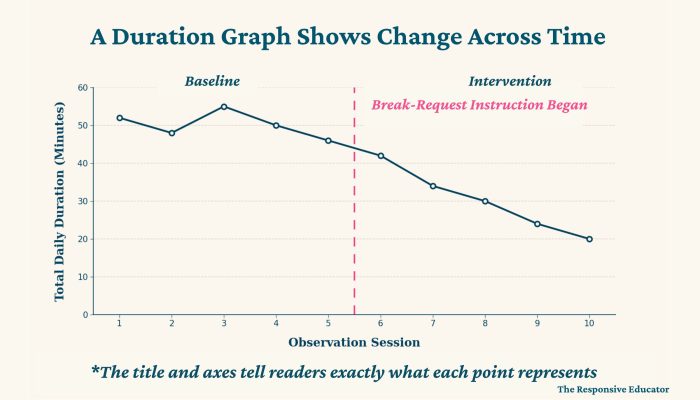
A phase line is a vertical line marking the point when an intervention or another important condition changed. Add a short label explaining what happened, such as:
Phase lines provide context. They allow the team to see whether the level, trend, or variability changed after an important event. A phase line does not prove that the event caused the change, but it does document when the change occurred so the team can ask better questions.
The y-axis should make meaningful changes visible without exaggerating them.
If a student’s behavior usually lasts between five and 15 minutes, a graph extending to two hours will compress the data near the bottom. A decrease from 15 minutes to seven may barely be visible even though the student has regained eight minutes of instruction during each episode.
The opposite problem occurs when the scale is too low. If the graph ends at 15 minutes and the student has a 60-minute episode, the data point will not fit. A very narrow scale may also make a small change appear more dramatic than it really is.
I generally choose a simple scale that extends slightly beyond the highest expected duration. If the behavior changes substantially, I adjust the y-axis while keeping the scale consistent across the phases I intend to compare. The purpose is not to make progress look larger or problems look smaller. The purpose is to represent the data honestly enough that another person can understand it.
One student I supported had received a one-to-one paraprofessional because his behavior was so disruptive that he was frequently removed from class. Many people assumed the additional adult support had solved the problem because each office removal was handled quickly and documented as a separate incident.
When I reviewed the records, I looked at a different outcome: the total amount of instructional time the student had missed. The paraprofessional’s documentation showed how many minutes he spent in the office or another setting outside the classroom. He had also received several suspensions, which meant he missed full school days in addition to the shorter removals.
To examine the complete impact, I converted the suspension days into instructional minutes and combined them with the documented time outside the classroom. By late fall, the student had missed nearly the equivalent of 10 full school days.
The office removals alone totaled approximately 1,560 minutes—more than four full school days of instruction. The additional suspension days brought the cumulative loss much closer to 10 days. Very few people realized how much learning he had missed because each trip to the office or suspension had been considered separately.
This is an important example of why the graph must be labeled precisely. We were not necessarily graphing the duration of one specific challenging behavior. We were graphing total time removed from instruction, an outcome connected to both the behavior and the adults’ response.
A graph labeled “Behavior Duration” would not have accurately described those data. A title such as “Total Instructional Time Missed” with a y-axis labeled in minutes would tell the team exactly what each point represented. The suspension days would also need to be converted into the same unit before being included.
The cumulative graph made the educational impact difficult to overlook. The purpose was not to blame the paraprofessional, office staff, or administrators for responding to difficult situations. It was to help the team recognize that repeatedly removing the student from instruction had not solved the underlying problem and was creating a serious loss of access to learning.
Sometimes minutes are technically accurate but difficult to picture. Explaining that 1,560 minutes equals more than four full school days—and that the suspensions increased the total to nearly 10 days—gave the team a much clearer understanding of what the data meant for the student.
Parents, teachers, administrators, and related service providers may enter a meeting with different experiences of the student. A parent may see the student regulate successfully at home. A classroom teacher may be managing prolonged behavior during academic demands. An administrator may only see the student during the most serious incidents. A duration graph does not determine which perspective is correct, but it does give the team one objective source of information to consider together.
People may still disagree about why a behavior is occurring. The graph cannot establish the behavior’s function or explain every variable affecting the student. What it can show is whether the measured behavior is becoming shorter, lasting longer, or changing after an intervention or environmental event. That shared pattern moves the conversation away from debating whose impression is most accurate. The team can focus on what the data shows, what additional information is needed, and what support the student needs next.

Creating the graph is only half the process. Its real value comes from interpreting the information responsibly.
When I review a duration graph, I look at the overall level, trend, variability, and any changes surrounding phase lines. I do not begin by reacting to the highest point.
Level refers to the general amount of duration shown on the graph. A student whose episodes typically last five minutes presents a different instructional concern from a student whose episodes regularly last 50 minutes.
The level also helps the team determine whether progress is meaningful. A decrease from 60 minutes to 45 minutes is improvement, but a 45-minute episode may continue to interfere significantly with the student’s learning and require substantial adult support. Improvement and adequate progress are not always the same thing.
Ask whether the duration is generally increasing, decreasing, or remaining stable. A downward trend may indicate that the student is returning to instruction more quickly. An upward trend may suggest that the intervention needs closer review.
Behavior rarely changes in a perfectly straight line. A graph may show gradual improvement with occasional increases. Look at the direction across several observations rather than expecting every point to be lower than the one before it.
Some graphs contain points that remain close together. Others move sharply from short episodes to very long ones.
High variability may indicate that the duration is affected by particular tasks, settings, staff responses, times of day, or other conditions. One episode may last five minutes during a preferred activity and 45 minutes during a difficult academic demand. Variability does not automatically mean the intervention is failing. It tells the team to examine what is different across observations.
Look at the level, trend, and variability before and after an important change. Did episodes become shorter after the student learned to request a break? Did the duration increase after returning from vacation? Did the data become less variable after adults began responding more consistently?
These relationships are worth investigating, but they do not prove cause and effect. The graph shows when the pattern changed. Classroom observations and additional data help explain why.
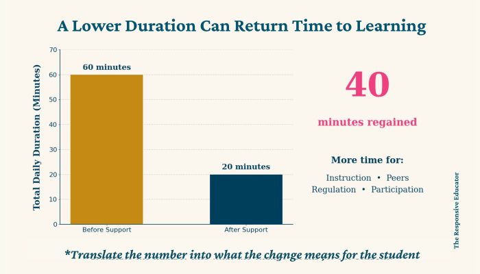
If a student’s total daily duration decreases from 60 minutes to 20 minutes, the graph is showing more than a lower number. The student has potentially regained 40 minutes that can be used for instruction, peer interaction, regulation practice, and participation in the classroom routine.
The teacher may also regain time previously spent responding to prolonged behavior. That can improve the learning environment for the entire class. This translation is what makes a duration graph useful. The graph is not only documenting a change in behavior. It is helping the team understand what that change means for the student’s access to learning.
Suppose a student’s duration decreases shortly after a medication adjustment, new reinforcement system, classroom change, or return from a school break. The timing may be important, but the graph alone cannot prove that one event caused the improvement.
Many variables can change at the same time. The student may also be receiving easier work, more adult attention, additional breaks, different consequences, or greater consistency from staff.
Use phase lines to document important changes, but describe the results carefully. It is appropriate to say, “The duration began decreasing after the intervention was introduced.” It would be stronger than the data supports to say, “The intervention caused the duration to decrease.”
If the duration changes sharply in a particular setting or after a particular demand, use that pattern to guide further observation. ABC data collection can help the team examine what occurs before and after the behavior. A graph points you toward the question; it does not provide every answer.
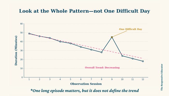
A single spike does not automatically mean an intervention has stopped working. Students become ill, sleep poorly, experience changes at home, return from breaks, and encounter unusually difficult tasks. One long episode may be important, but it is not necessarily the beginning of a new trend.
The same caution applies to one unusually short episode. A student having a successful day is encouraging, but it does not prove that the problem has been solved. Look across multiple observations whenever safety allows. Ask whether the level, trend, or variability is changing over time.
Safety-related behavior requires a different level of urgency. If a student is engaging in aggression, self-injury, elopement, or another dangerous behavior, the team must maintain appropriate safety procedures while collecting and reviewing the data. A gradual downward trend does not eliminate the need to respond to immediate risk.
A duration graph can be mathematically accurate and still be difficult or misleading to interpret. Most problems can be avoided by deciding exactly what the graph will represent before entering the data.
Do not graph the duration of individual episodes on some days and total daily duration on others. A 20-minute individual episode cannot be compared directly with a daily total that combines several occurrences.
Choose duration per occurrence, total duration, or average duration and use it consistently. If the team needs more than one view, create separate graphs with clear titles.
Seconds, minutes, and hours cannot be plotted together without conversion. Choose one unit and convert every observation before graphing. If most episodes last only a few seconds, seconds may be the clearest unit. If episodes last several minutes or hours, minutes will usually be easier to read.
A scale that is too large can hide meaningful change. A scale that is too small may exclude high data points or exaggerate minor differences.
Choose a scale that fits the expected data, and adjust it when needed. Keep the scale consistent across the phases you intend to compare.
Zero means the behavior was observed and did not occur. It does not mean the teacher forgot to collect data, the student was absent, or the observation did not happen.
Leave missing data blank or label it according to your system. Entering zero for a missing observation can create the appearance of progress that did not occur.
Teachers sometimes collect excellent duration data for weeks but leave the forms in a folder until a meeting approaches. By then, the opportunity to make timely instructional decisions may have passed.
Update the graph often enough that it can guide the intervention while it is happening. A pattern that becomes visible today may help you adjust support before several more weeks of instruction are lost. Collecting data is only half the work. Its value comes from using it.
Behavior change is rarely perfectly linear. Several observations are usually needed before deciding that an intervention is producing a reliable change. Look for patterns rather than requiring every data point to move in the desired direction. At the same time, do not use the need for more data as a reason to delay necessary action when behavior presents a safety risk.
Phase lines help document when something changed. They do not prove why the duration increased or decreased. Combine the graph with classroom observations, ABC data, academic information, family input, and professional judgment. The duration graph is one part of the student’s story.
You can create a duration graph in Excel or Google Sheets by entering the dates and duration measurements, selecting the data, and inserting a line graph. For teachers comfortable with spreadsheets, building a graph from scratch is certainly possible.
The process becomes more time-consuming when you are monitoring several students, calculating total or average duration, adding phase lines, and preparing graphs for meetings. Most teachers would rather spend that time interpreting the information and supporting students.
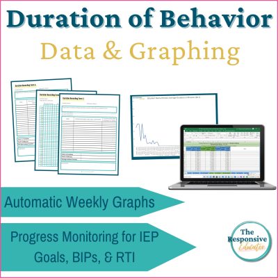
That is why I created my Duration Recording Forms and Graphing System. The resource includes editable duration data sheets, automatic duration graphs in Excel and Google Sheets, multiple forms for different observation needs, example graphs, and step-by-step directions.
The system handles the repeated graph formatting, but it does not decide what the data means. Your knowledge of the student, the classroom conditions, and the purpose of the intervention remains essential.
If you are building a broader behavior data system, the duration resource works alongside my frequency, rate, interval, and ABC data resources. These options allow you to choose the measurement that best answers your current question rather than trying to use one form for every behavior.
A duration graph does more than organize minutes on a page. It helps teachers see whether prolonged behavior is becoming shorter, remaining stable, or consuming more of the student’s day.
The most important information is not always the highest point or the steepest line. It is what the pattern means for the student. A decrease in duration may represent more time in instruction, greater access to peers, faster recovery after frustration, or growing use of a replacement skill.
The goal is not simply to make the duration decrease. We need to understand what is contributing to the behavior, teach the skills the student needs, and adjust adult support and classroom conditions when necessary. The graph helps us evaluate whether those changes are moving the student toward greater participation, regulation, and independence.
If you are ready to continue through the behavior measurement series, the next post explains interval recording and when sampling behavior across set periods may provide more useful information than counting or timing every occurrence.


Support your students’ individual needs with our exclusive Classroom Concerns Checklist.
Identify key concerns in areas like cognitive skills, communication, social/emotional behavior, and more.
Sign up now to receive instant access and valuable insights on addressing classroom concerns.
Don’t miss out, join our community today!

Support your students’ individual needs with our exclusive Classroom Concerns Checklist.
Identify key concerns in areas like:
…and more to help drive collaboration and problem-solving.
Sign up now to receive instant access and valuable insights on addressing classroom concerns.