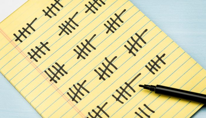
You have been collecting frequency data for several weeks. Each day, you tally how many times the behavior occurs, record the total, and add another page to the growing stack on your desk. Then someone asks the question that matters most: “Is the behavior actually improving?”
Looking back through rows of numbers may give you a general impression, but it can be difficult to see what is happening over time. One difficult day can stand out more than several weeks of steady improvement, while a gradual increase may be easy to miss when the data is spread across multiple forms. A behavior frequency chart turns those daily counts into a visual pattern that is much easier to recognize and explain.
The graph is telling a story. It may show that a behavior is steadily decreasing, staying about the same, becoming more inconsistent, or changing after a new support is introduced. That story can help you evaluate classroom interventions, monitor IEP or BIP goals, explain progress to families, and support decisions about whether services should be continued, adjusted, increased, or faded. This is why behavior graphs are useful for classroom teachers monitoring Tier 2 supports, case managers tracking IEP goals, and behavior specialists evaluating intervention response.
However, simply creating a graph is not enough. A graph can be difficult to interpret—or even misleading—when the y-axis does not fit the data, important changes are not marked with phase lines, or conclusions are based on one unusually good or difficult day. To understand the story your graph is telling, you need to look at the trend, the context, and what changed along the way.
This article will walk you through how to turn frequency counts into a clear behavior graph and, more importantly, how to interpret that graph responsibly. We will look at choosing an appropriate scale, keeping your data consistent, using phase lines to explain meaningful changes, recognizing patterns without jumping to conclusions, and using the information to make better decisions for students.
This article assumes you have already decided that frequency count is the right way to measure the behavior. If you are still deciding whether to use frequency, duration, interval, rate, or another method, begin with Behavior Data Collection: How to Choose the Right Measurement Method. For a closer look at the types of behaviors that frequency count measures well—and the situations in which another method may provide a clearer picture—read Frequency Count: When Is It the Right Choice?
A behavior frequency chart does much more than organize data. It helps you answer one of the most important questions in behavior support:
“Is what we’re doing actually working?”
When data is graphed consistently, it becomes much easier to identify patterns that might otherwise go unnoticed. Instead of relying on memory or isolated incidents, you can see whether behavior is generally improving, remaining stable, or becoming more frequent over time.
A behavior frequency chart can help you:
Just as importantly, a graph allows everyone involved to look at the same information. Rather than debating whether behavior seems “better” or “worse,” the conversation can focus on what the data actually shows.
Creating a behavior frequency chart is fairly simple once you’ve collected consistent frequency data.
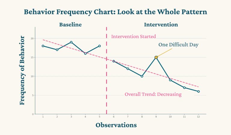
Begin by placing your observation dates on the horizontal (x) axis and the number of times the behavior occurred during each observation period on the vertical (y) axis. Plot one data point for each observation period and connect the points with a line so you can easily see changes over time.
The mechanics of creating the graph are relatively straightforward. The real challenge is creating a graph that accurately represents what happened in the classroom and is easy for others to interpret.
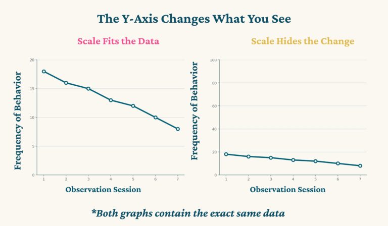
One of the most common graphing mistakes is choosing a scale that doesn’t fit the data you’re collecting.
If a student’s highest frequency count is 17, I would probably set the top of the graph to 20. I typically use multiples of five because they’re easy to read and usually provide enough room to see meaningful changes in the behavior.
The goal isn’t to create the perfect scale on your first attempt. If a student’s behavior suddenly spikes above your highest value, it’s easy to adjust the y-axis and update the graph. What matters is choosing a scale that allows the data to be read clearly.
If the numbers on the y-axis are too small, important changes in behavior may be compressed until they are difficult to recognize. If the scale is too low, some data points may not even fit on the graph. Either way, the graph stops telling the story accurately.
Even the most beautiful graph isn’t helpful if the data going into it isn’t consistent.
Frequency data should be collected using the same behavior definition, during comparable observation periods, and using the same measurement procedures each time. If one day you’re counting behavior during math class and the next day you’re counting across the entire school day, your graph won’t provide an accurate picture of student progress.
It’s also important to keep your graph updated.
I’ve seen teachers faithfully collect data for weeks, only to leave the forms sitting in a folder or on their desk without ever transferring the information to a graph. The intervention may already be showing signs that it’s working—or that it needs to be adjusted—but you won’t recognize those patterns until you actually look at the data over time.
A behavior frequency chart isn’t just a record of what happened. It’s a decision-making tool. The sooner you update it, the sooner it can begin helping you make better instructional decisions.
Imagine picking up a novel and discovering that several chapters have been removed. You could still read the beginning and the end, but you would have no idea why the story changed so dramatically in the middle. A behavior frequency chart works the same way.
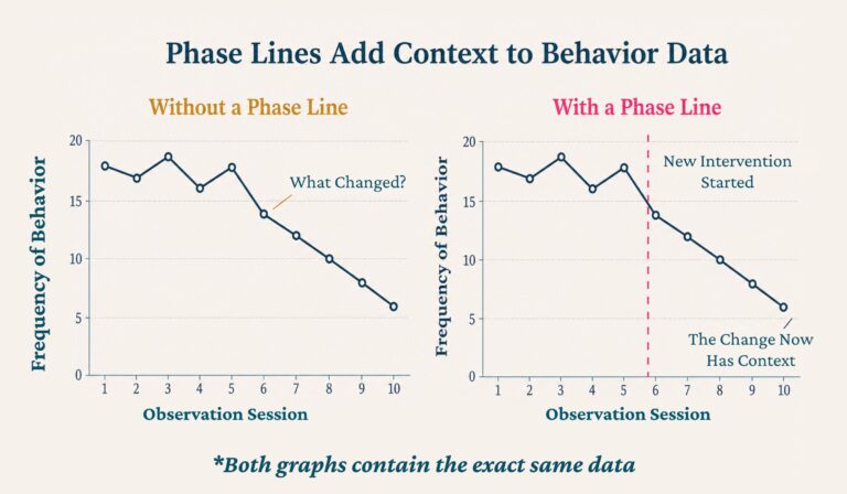
The graph shows what changed. Phase lines help explain when something important changed so you can better understand why the graph may have changed.
A phase line is simply a vertical line placed on your graph at the point where a meaningful event occurred. A short label identifies the event, such as Intervention Started, Medication Change, Winter Break, or Classroom Change.
Those simple labels provide valuable context for anyone reviewing the graph. Without them, a parent, administrator, or IEP team member is left guessing why behavior suddenly improved or became more challenging. With them, everyone can immediately see which events may have influenced the student’s progress.
Some common reasons to add phase lines include:
Notice that these labels don’t explain why behavior changed. They simply document when something important happened. That distinction matters. A phase line helps you ask better questions, but it doesn’t answer them automatically.
Medication is one topic that sometimes makes educators uncomfortable. While teachers should never recommend medication or tell families that a child should or should not be medicated, documenting a medication change as a phase line is entirely different.
If a parent voluntarily tells you that a medication was started, stopped, or adjusted, recording that information on the graph provides important context when interpreting the data.
Throughout my career, I always let parents know that I kept behavior graphs and would gladly provide copies if they wanted to share them with their child’s physician. Parents often appreciated having objective information to take to appointments, and doctors appreciated seeing behavior patterns instead of relying only on memory.
Sometimes the graph showed a dramatic improvement after a medication change. Other times it showed little difference or even an increase in challenging behavior. The graph didn’t tell the doctor what decision to make, but it gave everyone better information for making that decision.
One IEP meeting has stayed with me over the years because it perfectly illustrates both the power and the limitations of behavior graphs.
The student’s behavior graph showed that challenging behaviors consistently increased after weekends spent with one parent. During the meeting, the parents began arguing because one believed the behavior was related to medication that wasn’t being given consistently.
The graph showed a pattern. It did not prove the cause.
As educators, our role is not to decide which parent is right or to diagnose why a behavior changed. Our responsibility is to collect accurate data, document meaningful events when appropriate, and present the information objectively. The graph provides evidence that the team can consider alongside all of the other information available.
Good behavior data supports professional discussions. It should never become evidence for taking sides in family disagreements.

Once your graph is complete, resist the temptation to focus on individual data points. Instead, start by looking at the overall story.
Ask yourself:
Looking at the overall trend is much more informative than reacting to one especially good or difficult day. For example, a student who called out twelve times today instead of four may seem like they’ve had a terrible day. However, if the graph shows they were calling out thirty times per day only a month ago, today’s data tells a very different story.
Likewise, one excellent day doesn’t necessarily mean an intervention has solved the problem. Behavior change is rarely perfectly linear. Most students improve with periods of progress, occasional setbacks, and gradual stabilization over time.
Your goal isn’t to find a perfect graph. Your goal is to understand the story the graph is telling so you can make the next instructional decision with confidence.
One of the biggest mistakes I see is making decisions based on one unusually good or unusually difficult day.
Imagine you’ve implemented a new intervention and your student’s behavior frequency drops dramatically the next day. That’s encouraging, but it doesn’t necessarily mean you’ve found the perfect solution. Likewise, one difficult day after several weeks of improvement doesn’t automatically mean the intervention has failed.
Behavior is influenced by countless variables that aren’t always obvious when looking at the graph alone.
A student may have:
This is another reason phase lines are so valuable. They help explain some of the events that may have influenced the data, while reminding us that behavior should always be interpreted within the larger context of the student’s life. When evaluating a behavior intervention, look for patterns, not isolated points. One difficult day is one chapter in the story. It isn’t the entire story.

Another common mistake is deciding too quickly that an intervention isn’t effective. That doesn’t mean every intervention deserves months to prove itself. The amount of time you give an intervention depends on the behavior you’re trying to change.
For relatively minor classroom behaviors, such as calling out or leaving a seat without permission, improvement often happens gradually. A student who decreases from forty call-outs each day to twenty has made meaningful progress, even if the behavior hasn’t disappeared completely. Over time, you may continue adjusting your supports with the goal of reducing the behavior even further.
Safety behaviors are different.
If a student is engaging in physical aggression, serious self-injury, or other dangerous behaviors, your first priority is always maintaining safety. Appropriate safety procedures and supports need to be in place immediately while you continue collecting data and evaluating whether your intervention is working.
The graph still helps you monitor progress, but your expectations—and your urgency—are different.
For example, if a student is physically aggressive on 80% of school days, reducing that to 40% is technically an improvement. However, it doesn’t mean the problem has been solved. Unlike less serious behaviors, physical aggression usually requires stronger interventions and closer monitoring because the goal isn’t simply improvement—it’s keeping everyone safe.
Good behavior graphs help you recognize when an intervention is moving in the right direction, when it needs a small adjustment, and when a completely different approach may be necessary.
One of the most powerful examples I’ve experienced involved a high school student with emotional and behavioral disabilities who was transitioning from our behavior program back to her neighborhood school.
While she attended our program, her daily behavior data showed remarkable success. She consistently earned nearly perfect scores on her daily point sheets by staying on task, participating appropriately, cooperating with others, and meeting her behavior goals. Her mother wanted her to return to her home school as quickly as possible, but our team had concerns. Students typically transitioned back gradually so they could build confidence and adjust successfully.
An accelerated reintegration plan was approved, and I continued collecting behavior data throughout the process. Almost immediately, the graphs began telling a different story. Her scores dropped dramatically. She began eloping again, crying more frequently, and later we learned she had reported hearing voices when she returned to her home school.
At the next meeting, I didn’t have to rely on memory or opinion. I simply shared the graphs. They showed exactly when the reintegration began and exactly how her behavior changed afterward. The graph didn’t tell us why those changes occurred, but it clearly demonstrated that something had changed. That objective information helped the entire team have a much more productive conversation about what the student needed moving forward.
That’s one of the greatest strengths of a behavior frequency chart. It doesn’t replace your professional judgment. It strengthens it.

Creating a behavior frequency chart is relatively easy. Creating one that helps you make good decisions takes a little more thought. Here are some of the most common mistakes I see when reviewing behavior graphs.
Your y-axis should make the data easy to read. If the scale is too small, your highest data points may not even fit on the graph. If it’s too large, meaningful changes can become compressed until they almost disappear.
For example, imagine a student’s behavior typically occurs between 8 and 18 times per day. A graph with a maximum value of 20 would show those changes clearly. A graph that goes all the way to 100 would make those same improvements appear almost flat.
The goal isn’t to create a perfect scale on the first attempt. If behavior changes dramatically, you can always adjust the y-axis. The important thing is making sure the graph accurately represents the data you’re collecting.
Some teachers are excellent at collecting behavior data but never find time to graph it.
Weeks pass, data sheets pile up, and valuable information sits in a folder waiting to be analyzed. The problem is that your graph may already be showing you whether an intervention is working—or whether it needs to be adjusted.
Behavior data isn’t meant to be filed away until the next IEP meeting. It’s meant to guide instructional decisions while the intervention is happening. The more consistently you update your graph, the sooner you’ll recognize important patterns and respond appropriately.
A graph can only be as accurate as the data that goes into it. If you change your observation period, redefine the behavior halfway through data collection, or measure the behavior differently from one day to the next, your graph becomes much more difficult to interpret.
Consistency allows you to compare today’s data with yesterday’s. Without that consistency, you’re no longer measuring the same thing.
Without phase lines, the graph only tells part of the story. A sudden improvement may have followed a new reinforcement system. An increase in behavior may have occurred immediately after returning from spring break. A medication adjustment, classroom change, or revised intervention may explain a shift in the pattern. If those events aren’t marked on the graph, everyone reviewing the data is left guessing what happened.
A simple vertical line and a brief label often provide all the context the team needs.
This may be the most important mistake of all. Graphs help us identify patterns, but they do not prove why those patterns occurred.
If behavior improves after a new intervention, that is encouraging. If behavior changes after a medication adjustment or schedule change, that is important to notice. However, behavior is complex, and two events occurring around the same time does not necessarily mean one caused the other.
Your graph identifies relationships worth exploring. It does not establish cause and effect. If you need to examine what happens immediately before and after the behavior, ABC data collection can help you investigate the pattern more closely.
Always combine graph data with classroom observations, professional judgment, and input from the rest of the educational team before making important decisions.
Creating your own behavior frequency chart in Excel or Google Sheets is certainly possible, especially if you’re comfortable building spreadsheets and formatting graphs.
Many teachers, however, would rather spend their time analyzing behavior than creating formulas, formatting charts, and rebuilding graphs every time they begin monitoring a new student.
That’s exactly why I created my Frequency Recording Forms and Graphing System. The resource includes printable frequency recording forms, automatic graphing in both Excel and Google Sheets, step-by-step directions, example graphs with phase lines, and guidance for interpreting your data. It also includes a quick reference explaining when frequency is the appropriate measurement method and examples to help you get started.
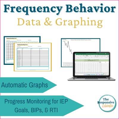
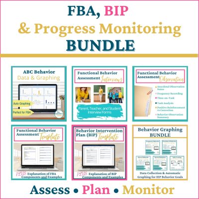
If you’re already using Functional Behavior Assessments (FBAs), Behavior Intervention Plans (BIPs), or IEP behavior goals, the frequency graphing system is also included as part of my FBA + BIP + Progress Monitoring Bundle, giving you a complete behavior support framework from assessment through progress monitoring.
When you’re ready to continue through the behavior measurement series, read Rate Count: Comparing Behavior Fairly Across Different Observation Times to learn when measuring behavior over a set amount of time provides a more accurate comparison.


Support your students’ individual needs with our exclusive Classroom Concerns Checklist.
Identify key concerns in areas like cognitive skills, communication, social/emotional behavior, and more.
Sign up now to receive instant access and valuable insights on addressing classroom concerns.
Don’t miss out, join our community today!

Support your students’ individual needs with our exclusive Classroom Concerns Checklist.
Identify key concerns in areas like:
…and more to help drive collaboration and problem-solving.
Sign up now to receive instant access and valuable insights on addressing classroom concerns.